

Textiles Color & Pattern Theory: Mastering Combinations
Color is one of the most powerful tools in textiles. Whether you’re creating garments, home decor, or art pieces, understanding how to effectively combine colors and patterns can transform your work from ordinary to extraordinary. This article explores the fundamentals of color theory as applied to textiles, with a special focus on the dynamic relationship between prints and solid colors.
The Basics of Color Theory
The Color Wheel
The foundation of color theory is the color wheel, which organizes colors in a circular spectrum. For textile work, understanding these relationships is essential:
- Primary Colors: red, blue, and yellow
- Secondary Colors: orange, green, and purple (created by mixing primary colors)
- Tertiary Colors: red-orange, yellow-orange, yellow-green, blue-green, blue-purple, and red-purple
Color Harmonies
Color harmonies provide frameworks for combining colors effectively:
- Complementary: Colors opposite each other on the wheel (blue/orange, red/green, yellow/purple)
- Analogous: Colors adjacent to each other (blue, blue-green, green)
- Triadic: Three colors equally spaced around the wheel
- Monochromatic: Different tones, shades, and tints of a single color
The Psychology of Color in Textiles
Colors evoke emotional and psychological responses that can significantly impact how a textile design is perceived. Across different cultures, the symbolic meanings of colors are shaped by traditions and cultural preferences. The global exchange of ideas has also played a role in how colors are perceived. In Western culture, some key colors and their typical meanings include:
- Red: Energy, passion, excitement
- Orange: Warmth, enthusiasm, creativity
- Yellow: Optimism, clarity, cheerfulness
- Green: Growth, harmony, freshness
- Blue: Calm, trust, stability
- Purple: Luxury, mystery, sophistication
- Pink: Sweetness, femininity, romance
- Brown: Reliability, comfort, earthiness
- Black: Elegance, power, sophistication,
- White: Purity, simplicity, cleanliness
Understanding these associations helps in creating textile designs that communicate specific moods or messages.
Colors often carry deep symbolic meaning within different cultures, and these associations can dictate their appropriateness for various occasions. Ignoring or unknowingly violating these cultural color taboos can lead to misunderstandings, or be perceived as disrespectful or even offensive.
Understanding these nuances is crucial, particularly in a globalized world where cross-cultural interactions are common. Individuals interacting across cultures should research and respect these color conventions to avoid unintended cultural faux pas and to ensure their creations or choices are well-received and understood within the intended cultural context.
The Role of Contrast in Textile Design
Contrast is what creates visual interest and impact in textile designs. Types of contrast to consider include:
Value Contrast
The difference between light and dark colors. High value contrast (black or very dark colors and white or very light colors) creates bold, dramatic effects, while low value contrast (light colors and medium colors) creates subtler, more harmonious designs.
Color Contrast
Different hues placed together create varying levels of contrast. Complementary colors create the highest contrast, while analogous colors create lower contrast.
Temperature Contrast
Warm colors (reds, oranges, yellows) against cool colors (blues, greens, purples) create a dynamic visual tension that can add energy to textile designs.
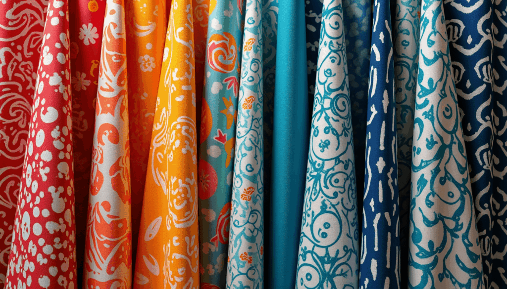
Combining Prints and Solids: Fundamental Principles
Scale Variation
When mixing prints, vary the scale between large-scale patterns, medium-scale patterns, and small-scale patterns. A good rule of thumb: combine one large-scale print with medium or small-scale prints for balance.
The 60-30-10 Rule
For balanced designs: – 60% dominant color (often a solid or subtle texture) – 30% secondary color or pattern – 10% accent color or bold pattern
Unifying Elements
Every successful print-solid combination needs unifying elements:
- A consistent color palette
- Repeated colors across prints and solids
- Common design elements or motifs
Practical Strategies for Combining Prints and Solids
1. Start with a Multicolored Print
Begin with a print you love that contains multiple colors. Extract colors from this print to use as your solid colors. This creates an automatic harmony.
2. Use Solids as Breathing Space
Solid colors provide visual rest between busy prints. They allow the eye to pause and appreciate the patterns.
3. Bridge with Transitional Prints
When combining distinctly different prints, use a transitional print that contains elements of both to create a cohesive look.
4. Consider the Negative Space
The background color of a print can function as another solid in your design. Ensure it coordinates with your other solids.
5. Balance Pattern Densities
If using a dense, busy pattern, balance it with a simpler pattern or solid. Too many busy patterns can create visual chaos.
Practical Applications for Seasonal Decor
Home Textiles (Pillows, Curtains, Throws)
Incorporating a thoughtful mix of prints and solids in your home textiles can dramatically transform the ambiance of a room, adding depth, interest, and a cohesive design narrative.
- Throw Pillows: The art of arranging throw pillows on a sofa or armchair lies in creating visual harmony and textural richness. The key takeaway is to avoid combining multiple patterned pillows with patterned upholstery, as this often leads to a visually cluttered and chaotic aesthetic that detracts from the room’s overall appeal. Start with solid upholstery and add printed pillows in a shared color palette for playful experimentation. For patterned upholstery, use solid throw pillows that extract and highlight key colors, balancing the look and grounding the pattern.
- Bedding: Creating an inviting and stylish bed often involves a layered approach that strategically mixes solids and patterns. Start with solid-colored sheets, which provide a clean and calming foundation. Introduce a patterned duvet cover as the focal point, allowing it to inject personality and visual interest into the bedroom. To complete the look, select accent pillows in coordinating solid colors that are extracted directly from the duvet’s pattern. This technique not only unifies the bedding ensemble but also creates a sense of intentional design, where every element feels purposefully chosen and harmonious. Consider incorporating different textures within your solids, such as a knitted throw or a velvet pillow, to add another layer of sensory appeal.
- Window Treatments: Window treatments play a crucial role in defining the character of a room, framing views and controlling light. The choice between printed and solid curtains, or vice versa, depends on the existing wall treatment. Against solid-colored walls, printed curtains can introduce vibrant patterns and colors, becoming a captivating design element that draws the eye and adds a dynamic touch. Conversely, if your walls feature patterned wallpaper, solid-colored curtains are the ideal choice. They provide a visual respite, allowing the wallpaper to shine without competing for attention, and offer a sense of calm and sophistication. The color of the solid curtains can either match a dominant hue in the wallpaper for a subtle blend or offer a contrasting shade for a more dramatic statement.
Quilting and Fiber Arts (Duvets, Throws, and Blankets)
In the realm of quilting and fiber arts, the interplay of prints and solids is fundamental to creating visually engaging and balanced designs.
- Block Contrasts: A classic and effective technique in quilting is to alternate solid-colored blocks with patterned blocks. This creates a visually dynamic rhythm across the quilt, where the solid blocks provide a moment of repose and allow the intricate details of the patterned blocks to truly stand out. The solid blocks can be used to emphasize a specific color or to create a negative space that enhances the overall design. Experiment with different block sizes and arrangements to achieve varying levels of contrast and complexity.
- Borders: When working with busy or intricate prints, solid borders are an invaluable design tool. By framing the active patterns with a solid color that pulls a hue directly from the print, you achieve several benefits. The solid border acts as a visual “breather,” preventing the print from becoming overwhelming and helping to contain its energy. It also serves to unify the design, making the entire piece feel more cohesive and polished. Furthermore, a well-chosen solid border can enhance the perceived size and presence of the textile, giving it a more substantial and finished appearance.
- Appliqué: Appliqué, the technique of applying fabric shapes onto a background, offers a wonderful opportunity to create striking visual impact through the strategic use of prints and solids. For maximum effect, apply printed fabric shapes onto solid backgrounds. The solid background allows the intricate patterns and vibrant colors of the appliqué pieces to pop, making them the undeniable focal point of the design. This contrast ensures that the appliqué stands out clearly, whether it’s a simple geometric shape or an elaborate floral motif, creating a compelling and artistic statement.
Common Mistakes to Avoid in Textiles
- Using too many colors: Limit your color palette to 3-5 colors for cohesion.
- Using too many patterns: Limit the number of unique patterns to avoid visual clutter.
- Matching too perfectly: Slight variations create more interest than exact matches.
- Ignoring scale: Using all small or all large prints can lack visual hierarchy.
- Forgetting about texture: Textured solids add depth without competing with patterns.
- Overlooking contrast: Without sufficient contrast, designs can appear flat.
Textile Colors, Solids, and Prints Overview
Mastering the art of combining prints and solids in textile design involves understanding color theory, embracing contrast, and applying practical principles of balance and harmony. By thoughtfully considering the relationship between colors, patterns, and scale, you can create textile designs with impact and appeal. Remember that while guidelines are helpful, experimentation is key to developing your unique aesthetic. Trust your eye, but inform your choices with these foundational principles of color theory and textile design.